Client
Taze Çiçek
Services
Branding
Logo Design
Illustration
Motion Design
Brand Guideline
Year
2025
Taze Çiçek: A Fresh and Consistent Brand Language
Overview
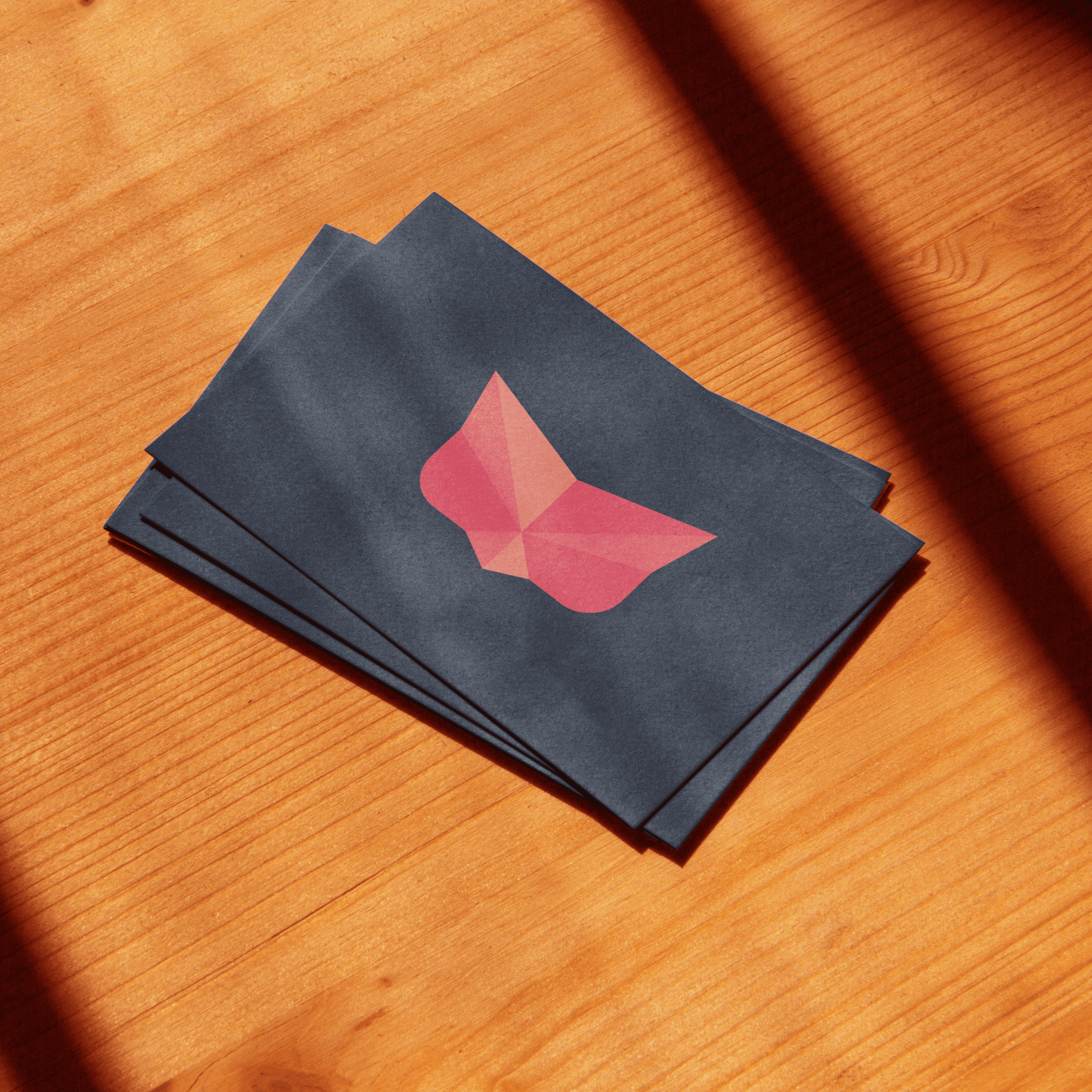
Taze Çiçek set out to express its sense of freshness, naturality, and vibrancy through a more consistent and refined visual language. Throughout the process, the existing brand identity was revisited and reorganized to create a clearer and more balanced brand expression across all communication channels.


The work focused on building a strong brand concept with clear brand and social media guidelines.
The work focused on building a strong brand concept with clear brand and social media guidelines.
The goal was to build a brand language that reflects Taze Çiçek’s positive and energetic character in a consistent way across digital and social platforms. As the brand’s communication channels expanded, there was a need for a visual structure that would be easy to apply, flexible, and sustainable over time.
The goal was to build a brand language that reflects Taze Çiçek’s positive and energetic character in a consistent way across digital and social platforms. As the brand’s communication channels expanded, there was a need for a visual structure that would be easy to apply, flexible, and sustainable over time.


The process was guided by the idea of “freshness” at the core of the brand.
The process was guided by the idea of “freshness” at the core of the brand.
The process was guided by the idea of “freshness” at the core of the brand.
The existing logo was refined in terms of typography, balance, and usage to better align with the overall visual language. Sketches and explorations created during the process were treated as supportive materials, reflecting the research and exploration behind the brand’s visual direction.
The existing logo was refined in terms of typography, balance, and usage to better align with the overall visual language. Sketches and explorations created during the process were treated as supportive materials, reflecting the research and exploration behind the brand’s visual direction.


Based on this foundation, the brand concept and key visual principles were defined to ensure a cohesive identity.
Based on this foundation, the brand concept and key visual principles were defined to ensure a cohesive identity.
Based on this foundation, the brand concept and key visual principles were defined to ensure a cohesive identity.


The resulting brand language was built around a clear brand concept rooted in freshness, supported by a comprehensive brand guideline that defines the core visual rules of the identity. A dedicated social media guideline was also created to ensure the same energetic and vibrant tone is consistently reflected across digital communication.
The resulting brand language was built around a clear brand concept rooted in freshness, supported by a comprehensive brand guideline that defines the core visual rules of the identity. A dedicated social media guideline was also created to ensure the same energetic and vibrant tone is consistently reflected across digital communication.


Thx
Thx
You might want to see additional creativity
All Works
You might want to see additional creativity
